After indie, trad publishing can feel to most authors like they’re being slowly beaten to death with wet lettuce.
These days I can draft, write, edit, proof read and have a book selling very nicely thank you, in the time it used to take just to get an ANSWER on a spec MS.
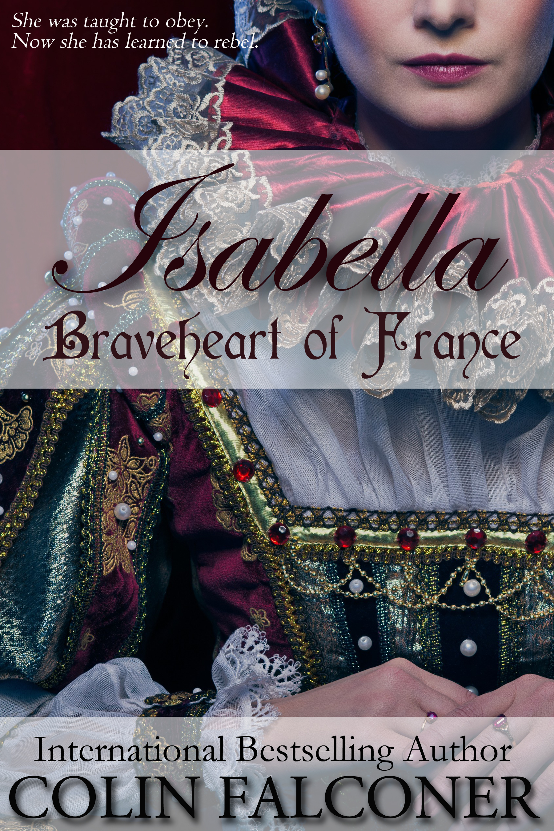
Isabella, for instance. It went to number 9 on Amazon paid in the same year that I started writing it. Meanwhile a book I finished back when MySpace was cool, is still waiting to get PB release. I think I wrote it on a typewriter.
The other thing that does my head in with print publishing is covers. Back in the day before eBooks, when Mariah Careys roamed the earth, I had no input in cover art.
Some of my finished covers were so bad, I used to host my own book burnings.
I wondered about the kind of people who actually created them. And not just mine. Who did the cover for A Casual Vacancy? They’d have to be legally blind.
It’s like some bizarre experiment. Let’s see just how bad we can make a cover before we even beat down JK Rowling.
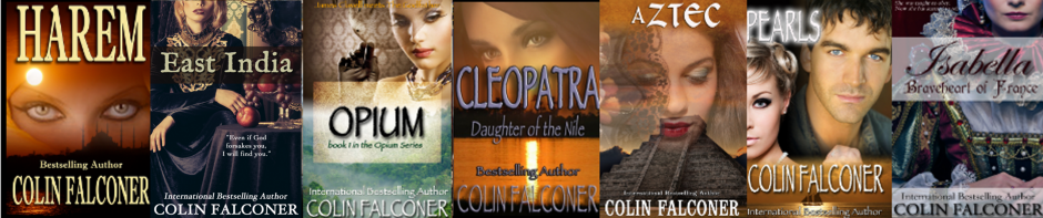
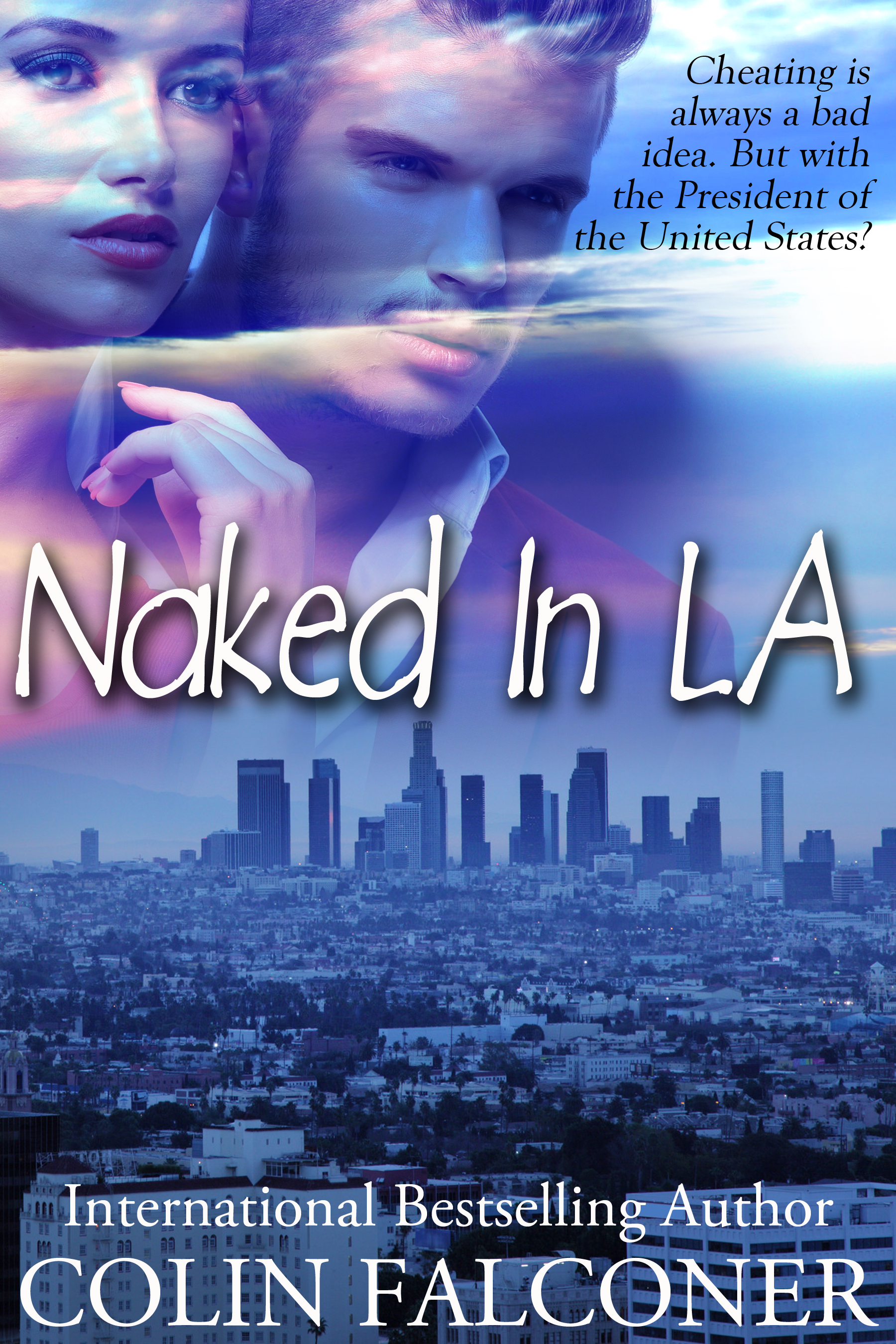
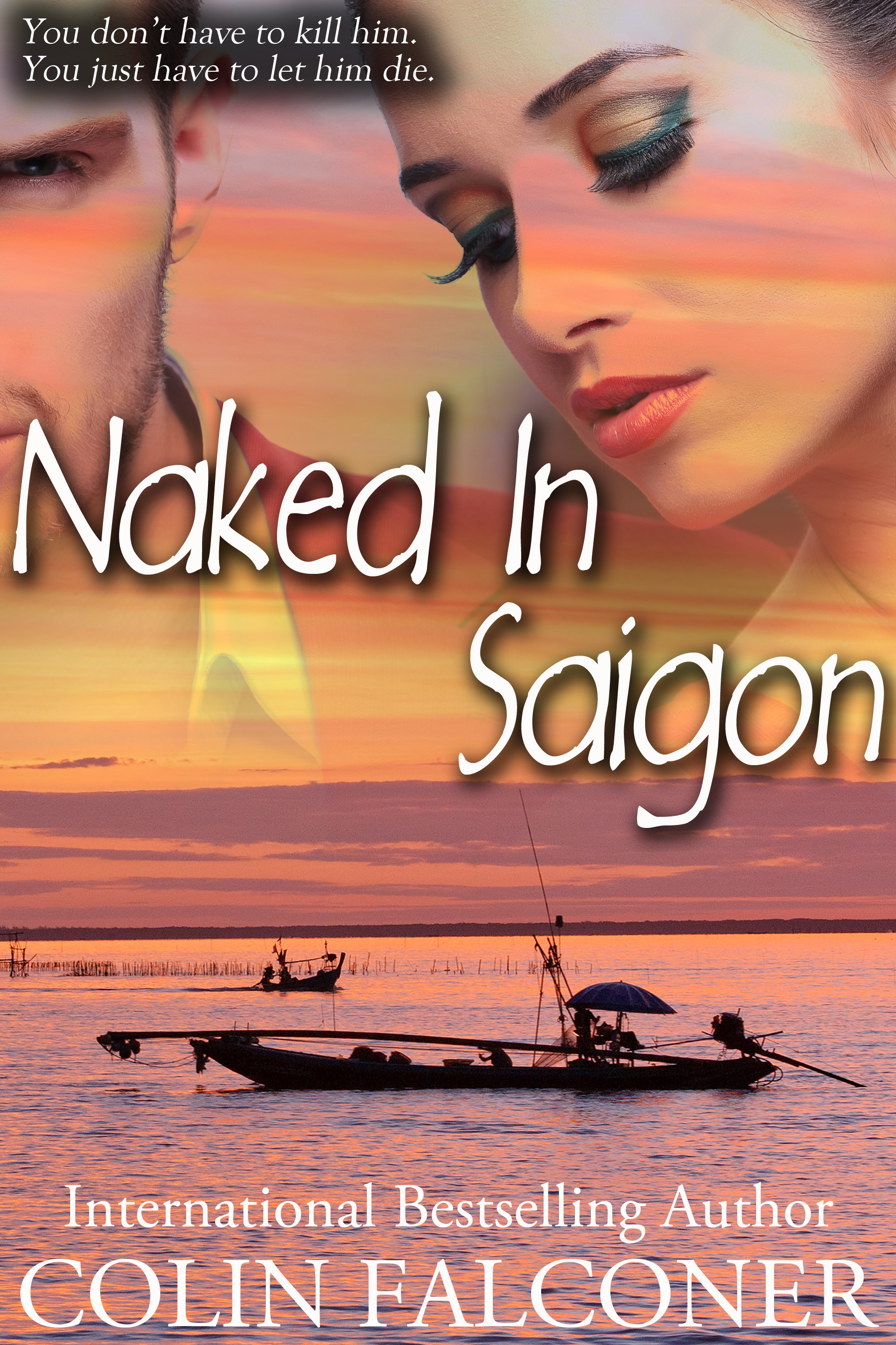
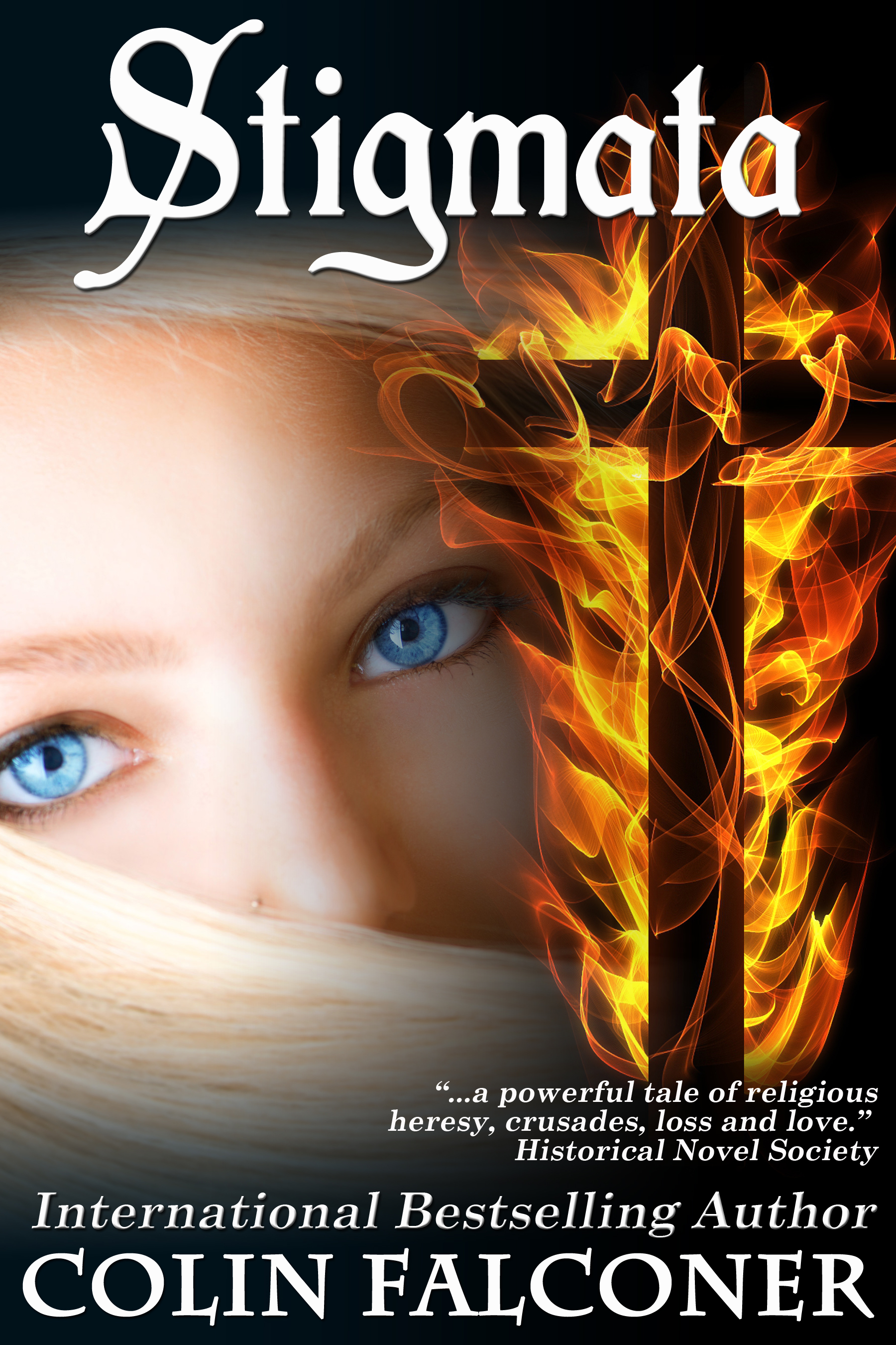
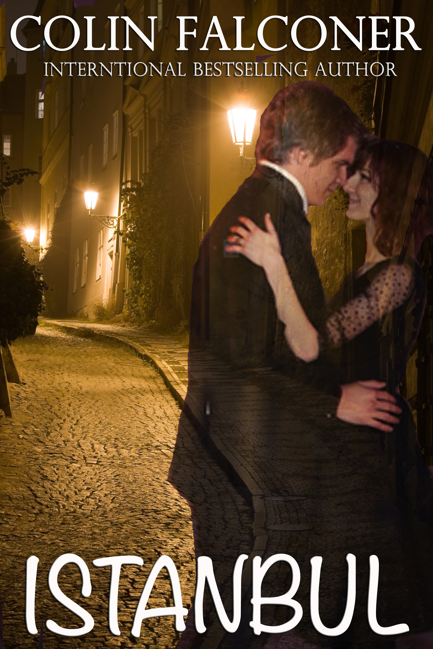
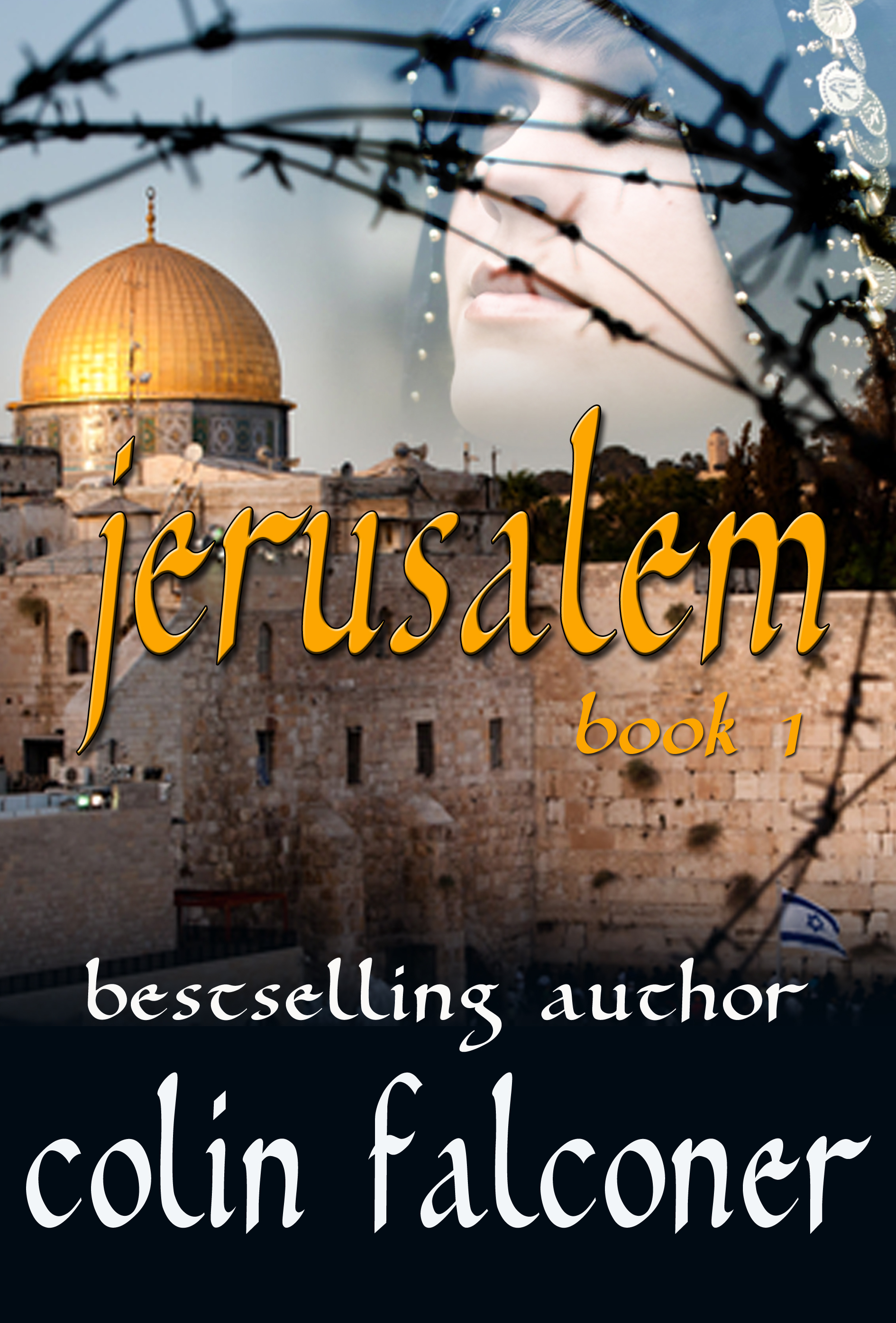
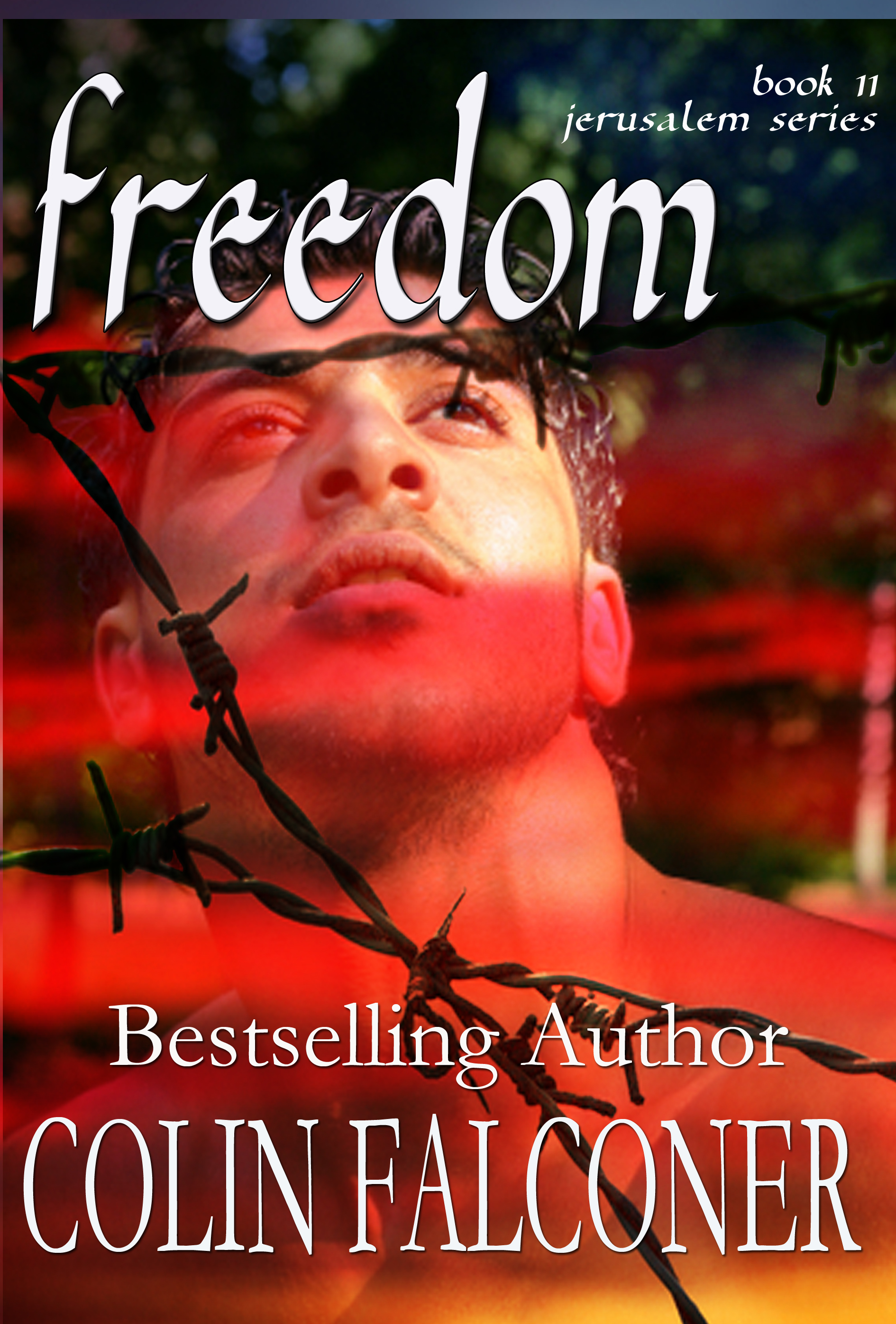
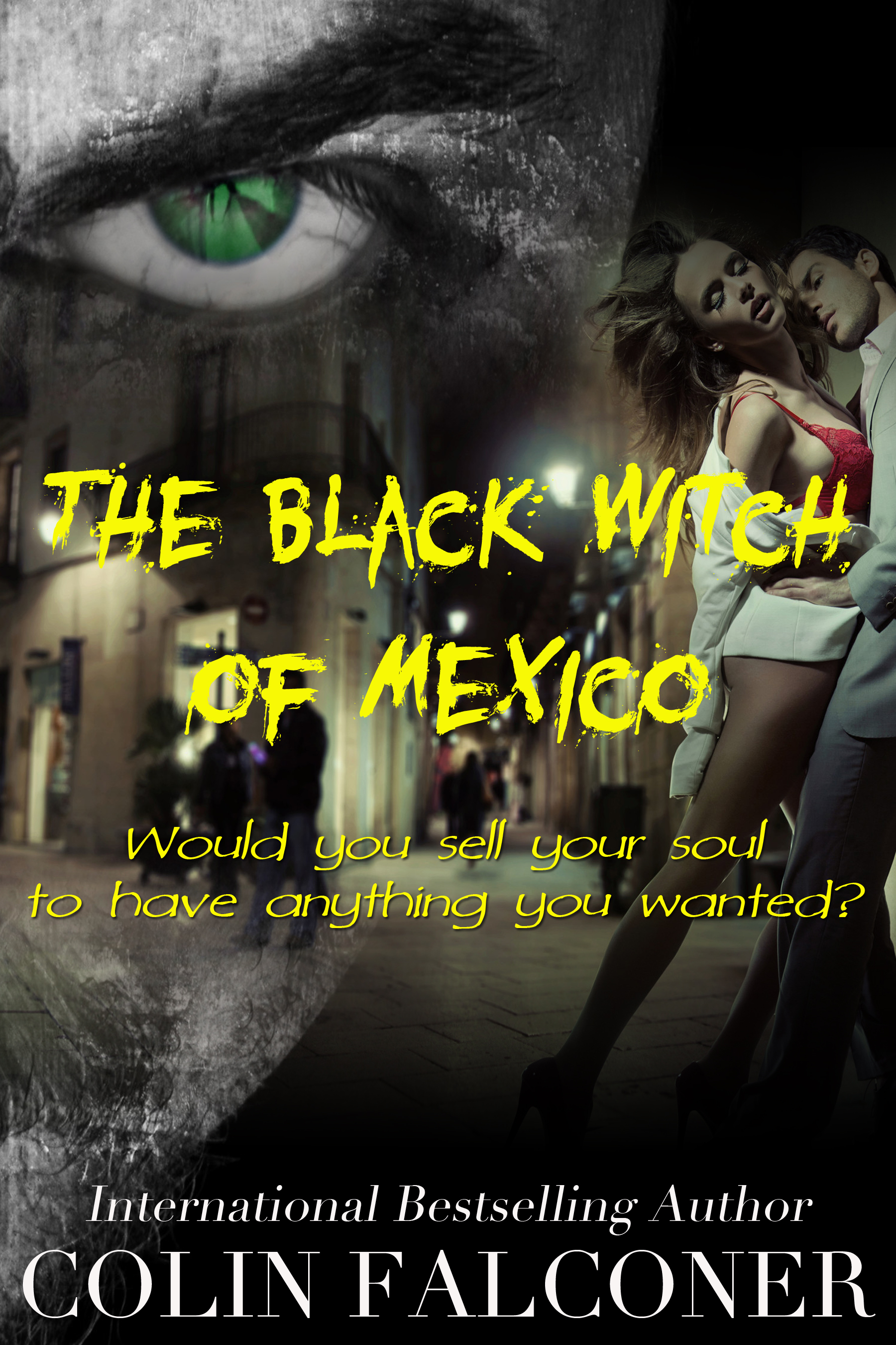
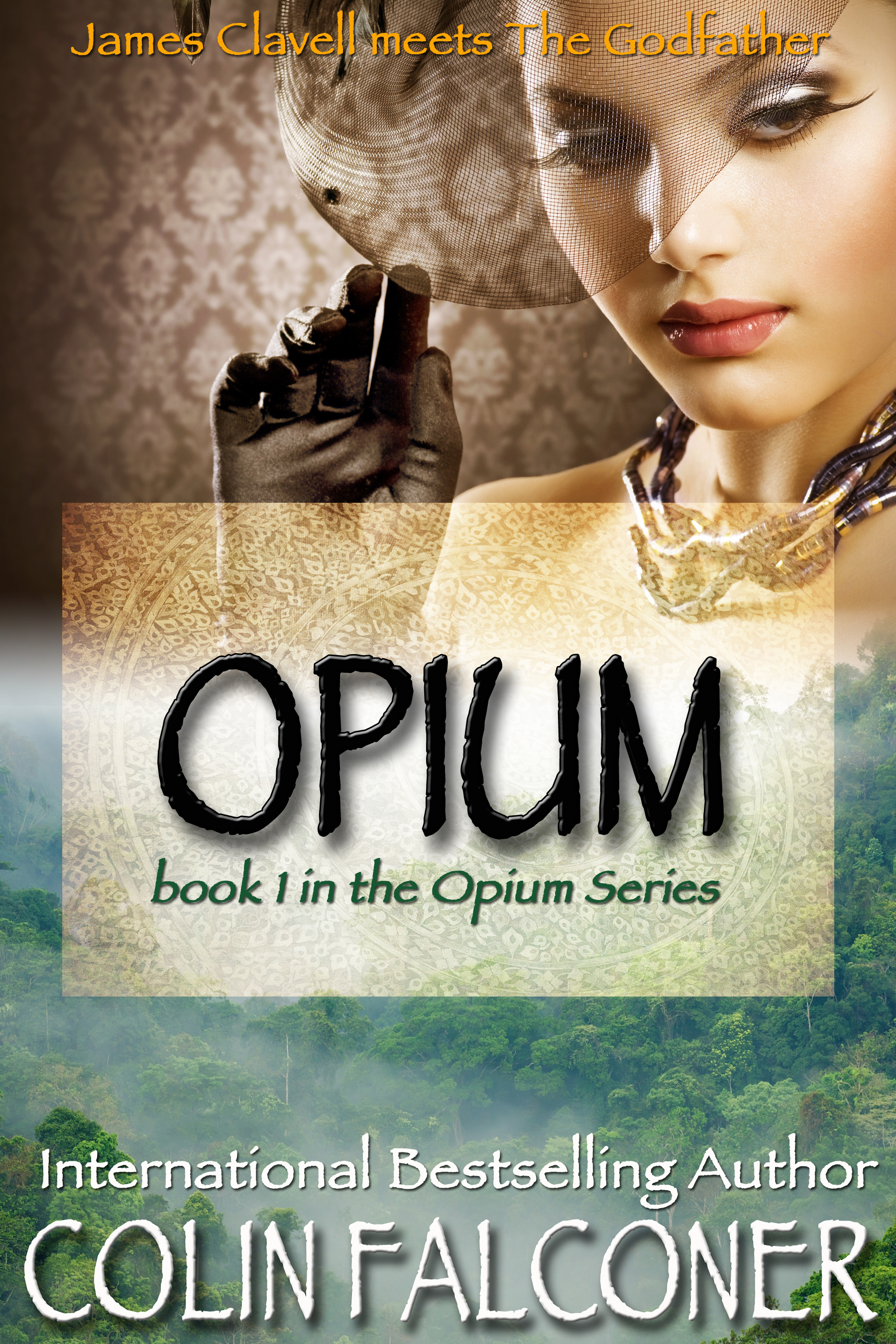
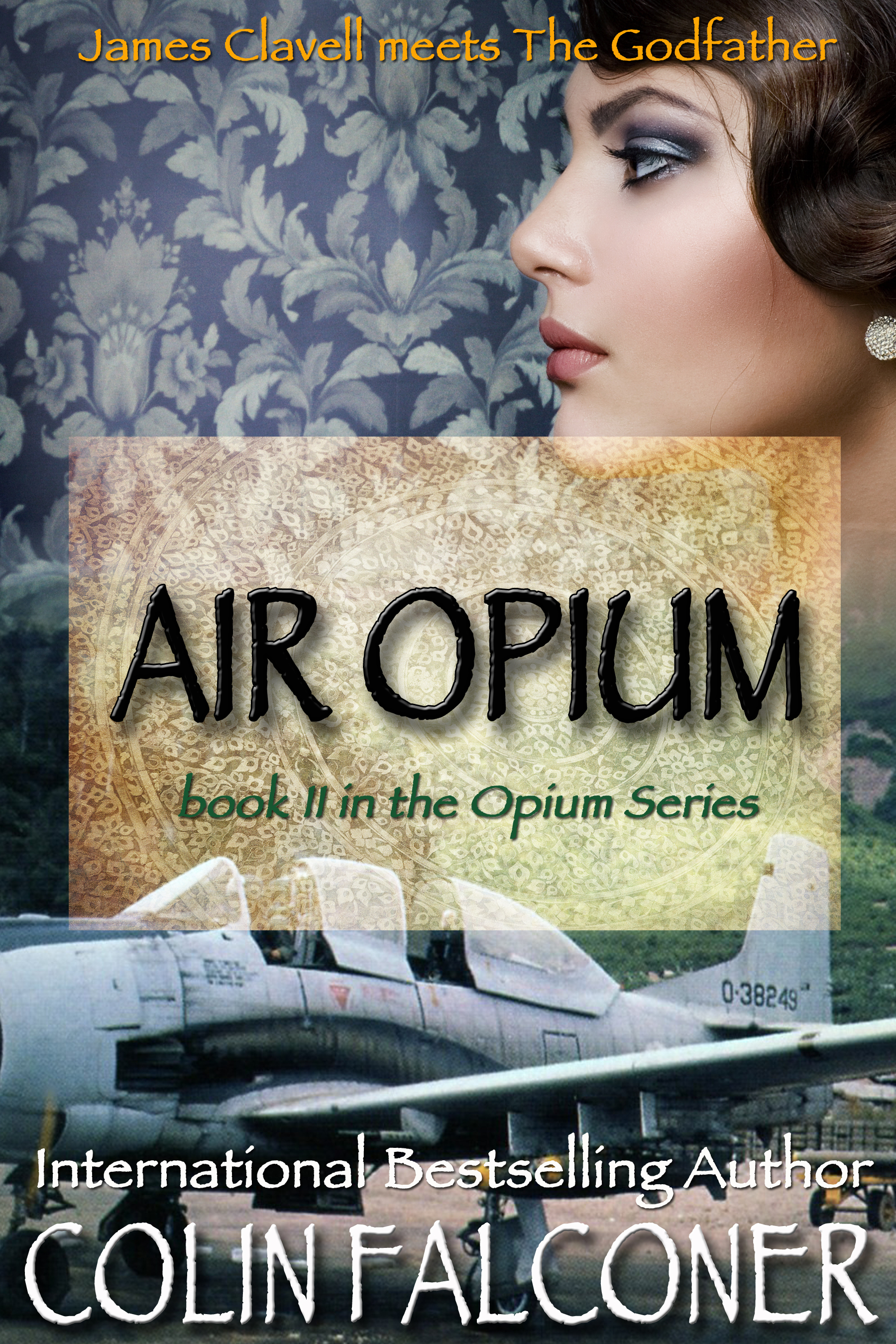
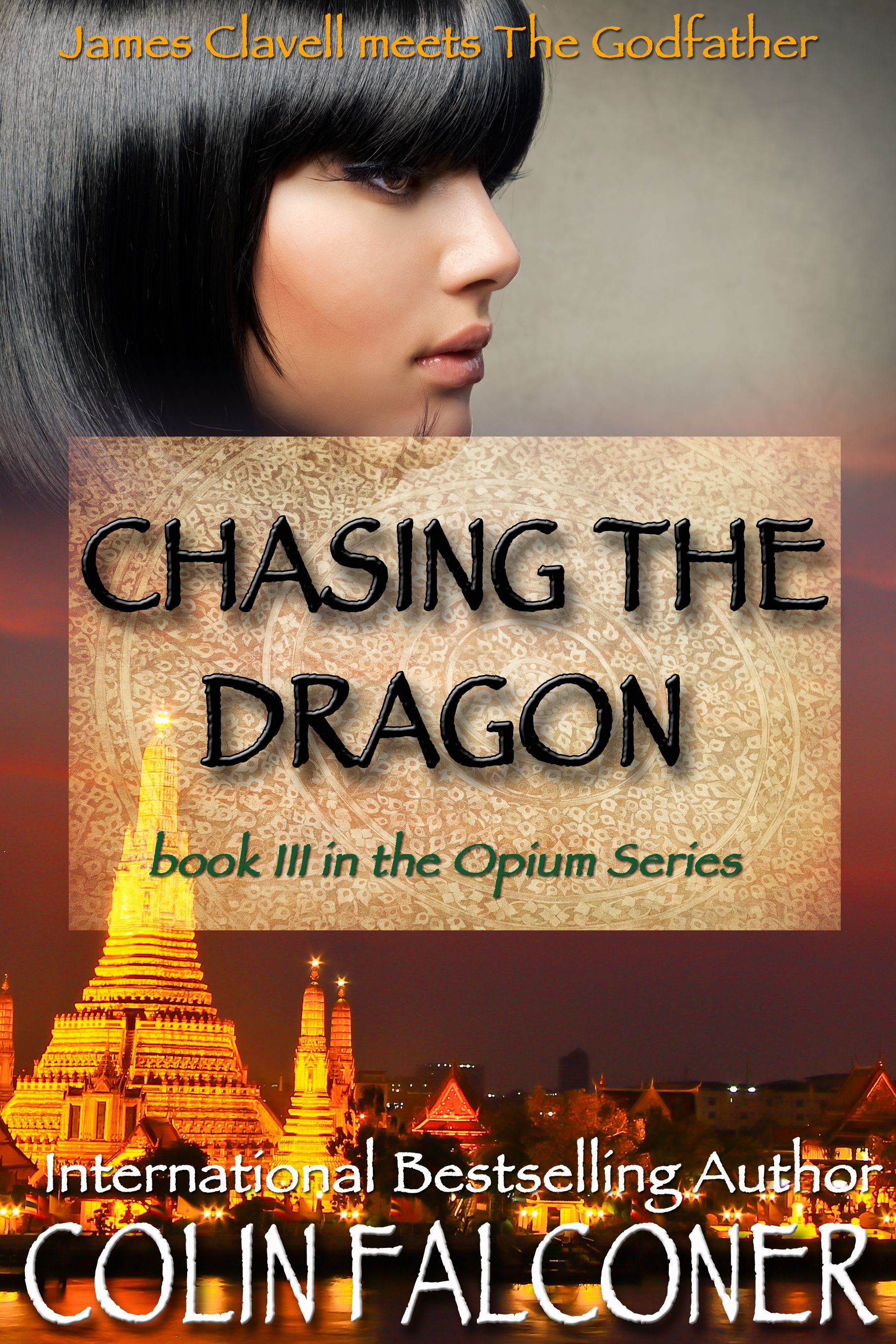
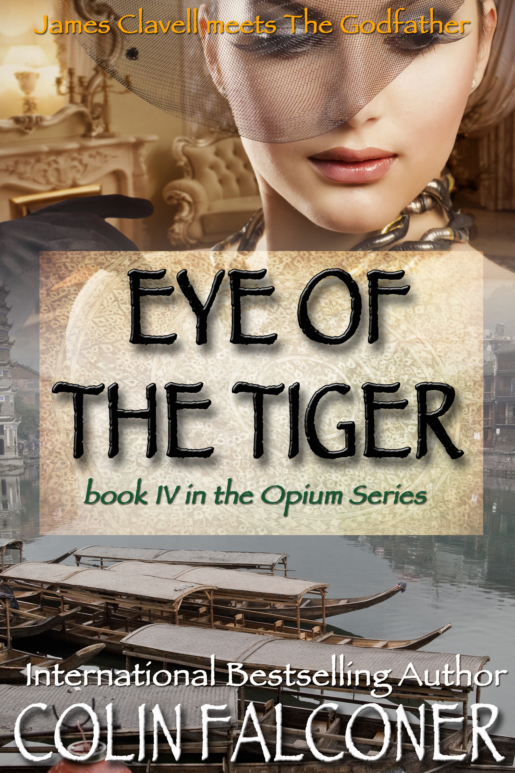
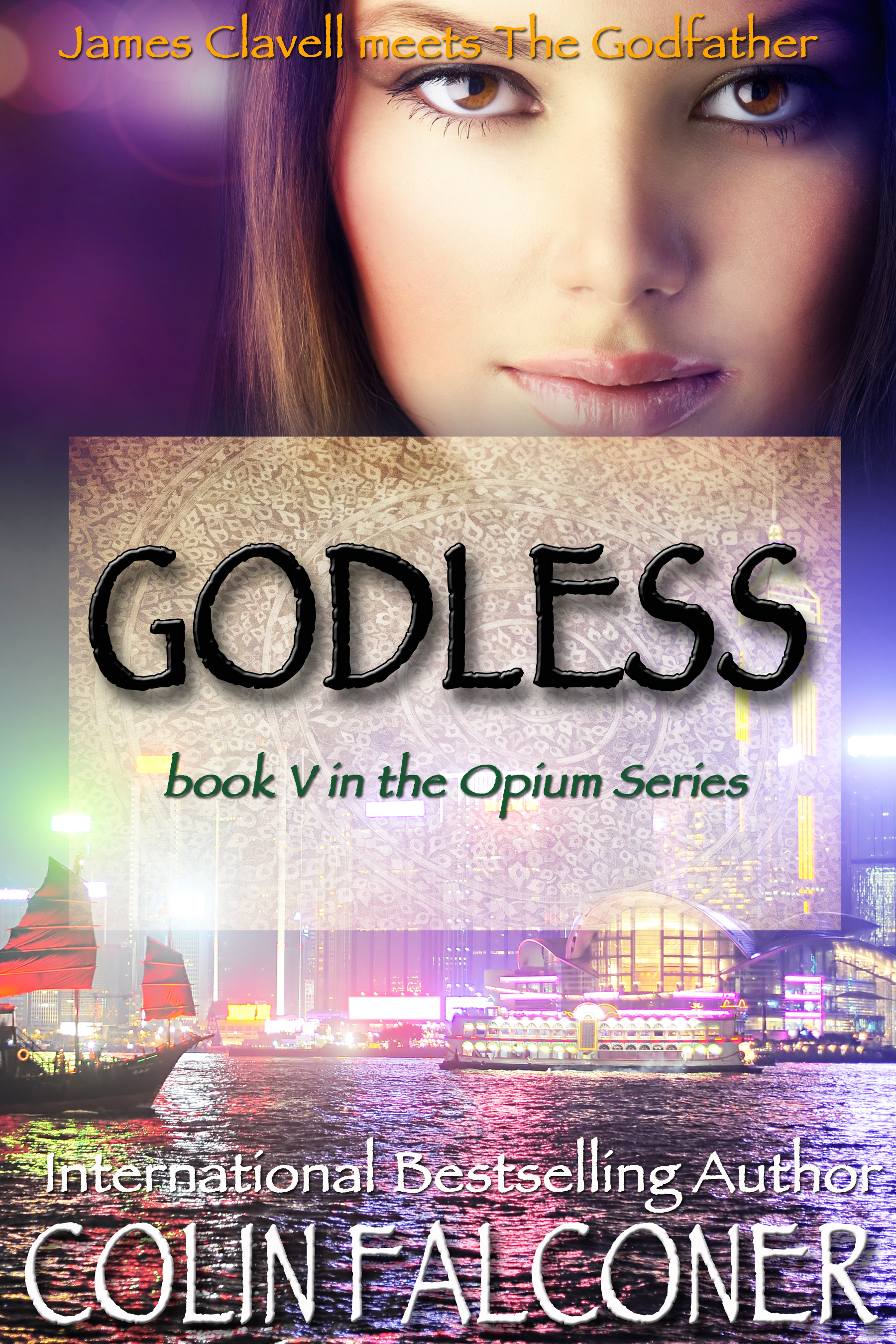
These days I have the wonderful Jen Talty at CoolGus designing my covers. Some of her creations have taken my breath away. They tell you what the book is about and set the tone of the book.
Hot damn. Revolution!
Book covers are that important.
A couple of years ago I was lucky enough to be invited to the Belgrade Book Fair. It accounts for HALF of Serbia’s annual book sales in a single week. People bus in from the country just to spend their year’s book budget in one day.
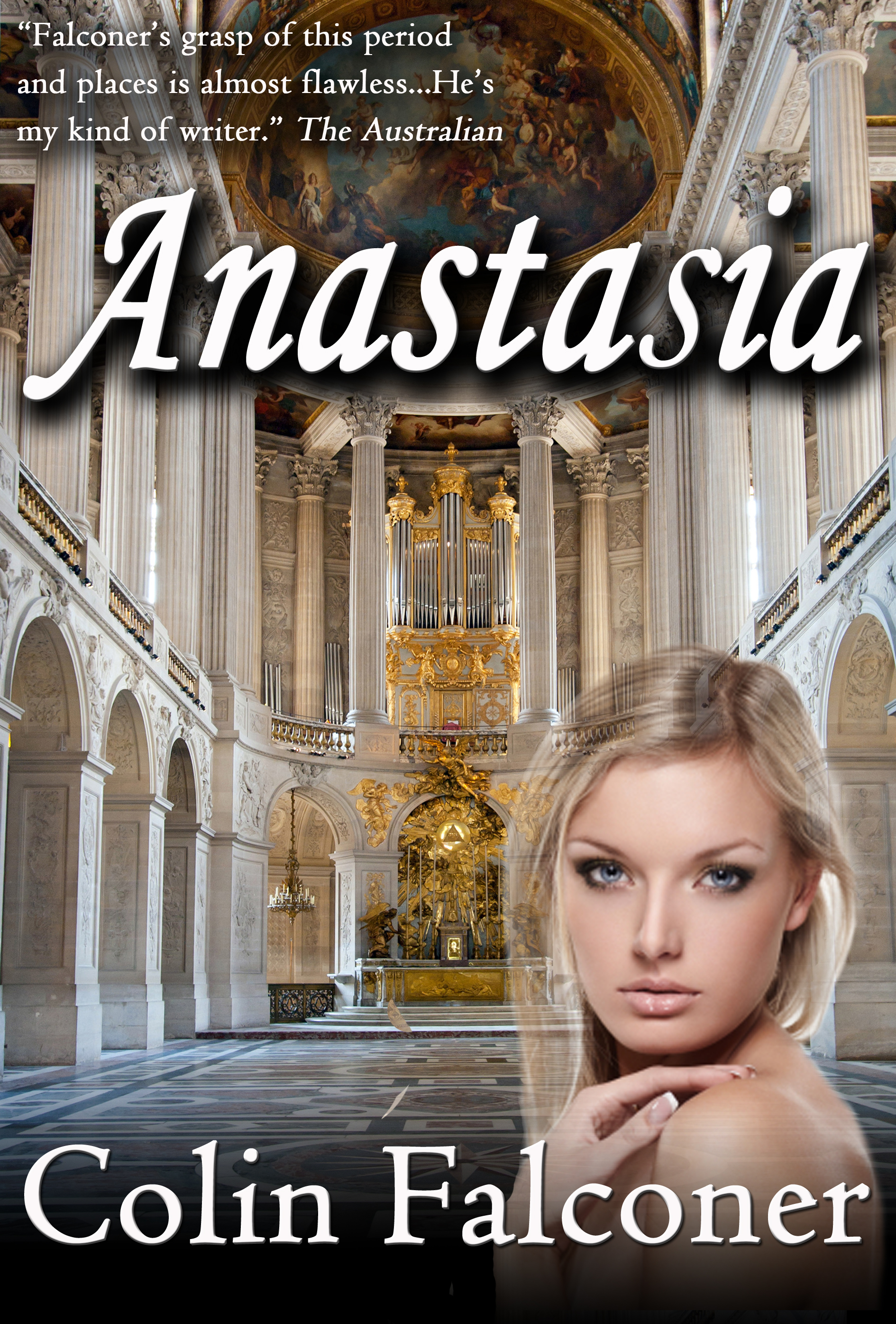
Readers like print books because they look and feel good so below is what my Serbian publisher did with Anastasia. It was lush.
But watching readers at work en masse is a sobering experience. They desperately search the entire pavilion for one promising cover. Is yours the one they will bat their eyes at across a crowded room?
Because buying a book is like speed dating. Your book has just a few seconds to make a good impression and if it has tomato sauce stains down its shirt or suffers brain freeze, then its potential date smiles ruefully and heads to the next bookstall.
Does your cover have serial killer eyes? Does it look like it still lives at home with its mother? Then you probably won’t get to drinks at the bar, which is:
Your blurb.
In your blurb you have about two hundred words to make a good first impression a second time. The clock is ticking. Quickly! Is it something your reader wants on their shelf when they have intellectuals around for canapés and a presumptuous merlot or is it a brown paper bag job about gym junkies in kilts chasing virgins around Scottish castles?
Its a fast and brutal process.
The potential reader skims the blurb, while checking text messages and updating their profile on Facebook.
They then open the book at a random page and read two sentences, tops. How does this help? I have no idea. I think every reader is secretly hoping to find pictures of naked models/gym junkies in kilts.
Finally they close the book with a sigh and a last rueful glance at the cover, like a lover they are leaving at the train station. At this point they either reach for their wallet or they put it down and move on to the next book.
The entire process takes fourteen point seven seconds.
It’s a sobering experience and made me thank God I have at last got someone who knows how to design a great cover.
But I’m still working on her about the naked pop-up pictures of Scarlett Johansen in a kilt in the middle pages.
I’ve told her it’s what readers are looking for, but she still doesn’t believe me.
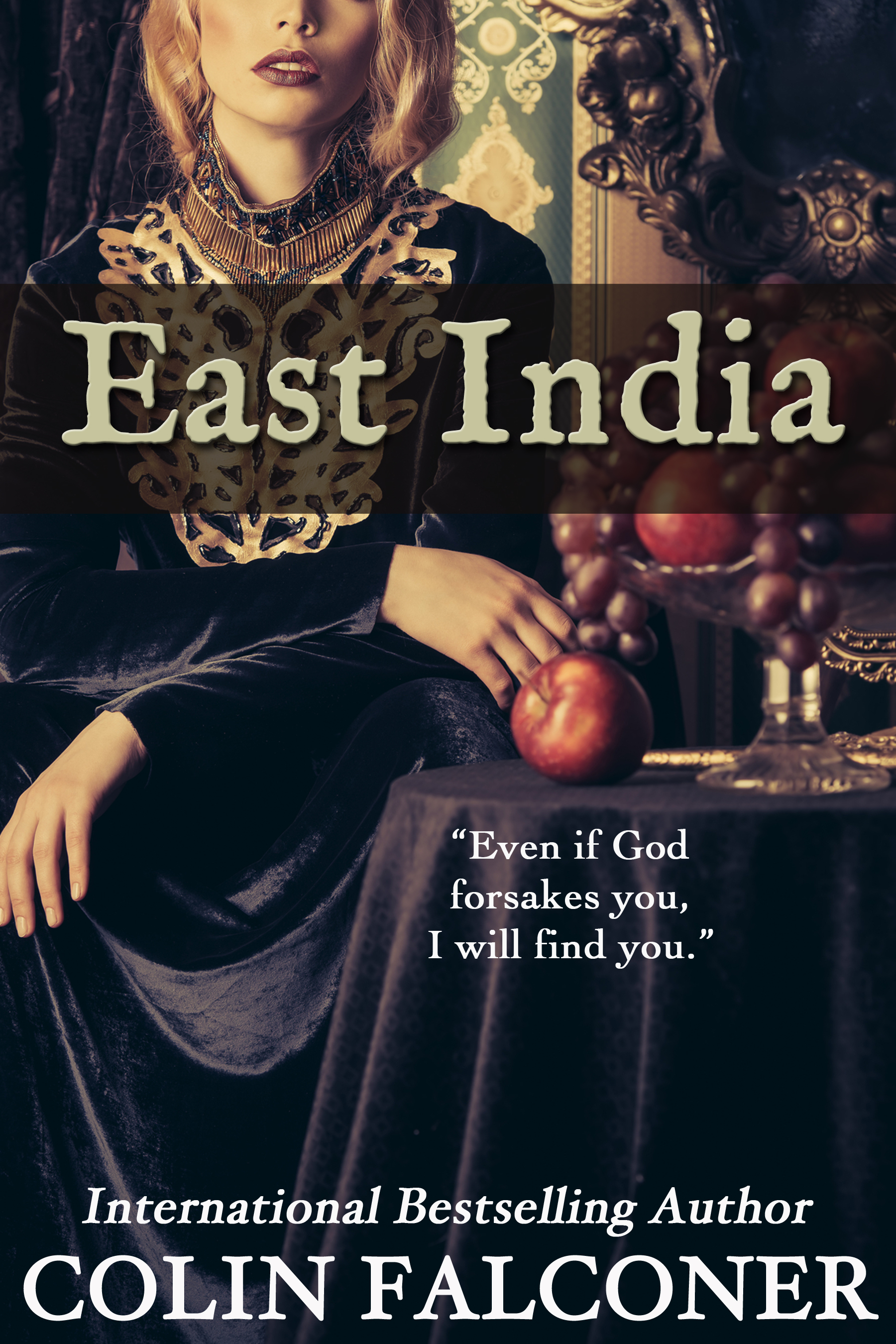
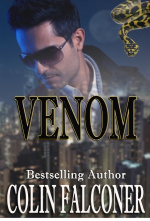
My latest novel, EAST INDIA, was published on 11 July!
Described by one critic as ‘Jack and Rose in the seventeenth century’, East India is a story of romance, courage and survival in the face of overwhelming odds.
If you’d like to win a free copy for your Kindle, Kobo or iPad just click here and join my newsletter subscription today!!


Cool….and thanks
Your cover for East India is gorgeous.
Thanks Emma! All credit to Jen Talty at CoolGus. She’s a genius.
Most of us don’t have a choice of cover - I have no interest in going self published, but even so, I have had some wonderful covers that bombed anyway because the bookshops didn’t know where to put the books. My children’s book on crime in Australia had a fabulous cover designed by the artist who dd the posters for the World SF con and if kids coud have found it, they would have grabbed it. In fact, one bookshop manager who did put it where it could be found told me he’d sold twenty copies in two days. BUT the distributor had it on the wrong part of the web site. The bookshops couldn’t believe it was a children’s book and put it with the adult true crime. Even if they had put it in the right section, bookshops haven’t a clue how to arrange children’s non fiction. So my poor book child was hiding in the kitchen, quite unable to speed date.
You used to write for kids yourself, Colin. You even appeared on the CBCA shortlist once. We have a few of your books in the class set room of my library. I guess they’re out of print now? Whereas you can keep your adult self pubbed books going as long as you like and you’re very good at promoting them.
I share your frustration with bookshops, Sue. There’s a good reason Amazon have become so successful and I believe it has nothing to do with pricing - it’s just easier to find the books you want.
Yes, wrote four or five kids books, won a couple of awards, but I wrote them mainly for my own kids. It’s a buzz to know they’re still on class room shelves somewhere! Surfing Mister Petrovic was always very popular, it might even still be in print after all these years!
Cover and blurb are often more work than writing the novel itself. The best advice I’ve come across for the blurb is to write it like an ad. Short, simple, snappy. Easier said than done.